 Avg. 2 min read
 Test on Mobile Devices with Chrome

This guide explains how to use Chrome DevTools Device Mode to preview and test your website on mobile viewports.
Limitations
Device Mode simulates the mobile experience on your computer. Some behaviors cannot be emulated precisely, such as GPU rendering, fonts, and device sensors. In some cases, rendering may differ from a real device.
Open the inspector in Chrome
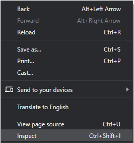
Right-click an empty area on your website and select Inspect from the menu.
Simulate a mobile viewport
Click Toggle Device Toolbar  to open Device Mode and emulate a mobile viewport.
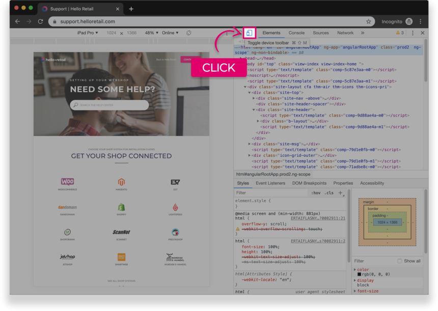
Figure 1. The Device Toolbar
By default, the Device Toolbar opens in Responsive Viewport Mode.
Mobile Device Viewport Mode
To simulate a specific mobile device, select it from the Device list in the top toolbar.
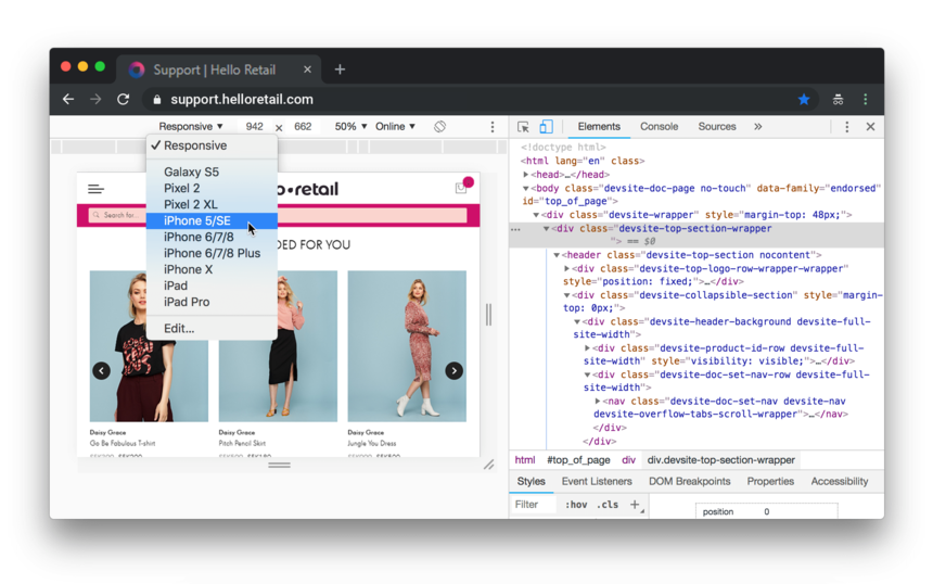 Figure 2. The Device list
Rotate the viewport to landscape orientation
Click Rotate  to switch the viewport to landscape orientation.
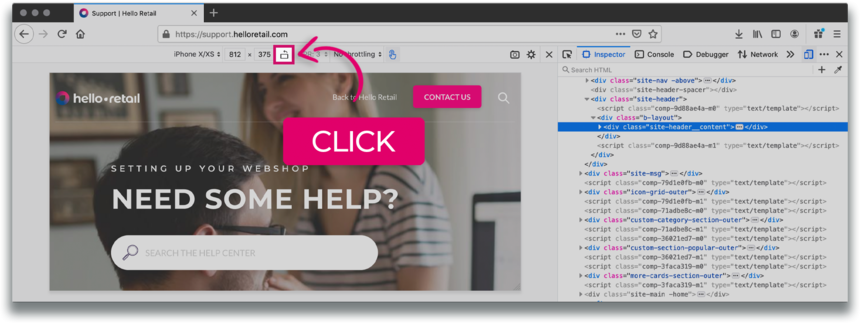
Figure 3. Landscape orientation
Notification
If you need to preview your page from a mobile perspective in another browser, select your browser:
 Firefox