 Avg. 2 min read
 Test on Mobile Devices with Firefox

Use Firefox Responsive Design Mode to simulate how your page renders and behaves on mobile devices.
Limitations
Responsive Design Mode simulates viewport size and some device behaviors on your computer. It does not fully emulate hardware, operating systems, or browser engines. Rendering and performance can differ from a real device in some cases.
Open the inspector in Firefox
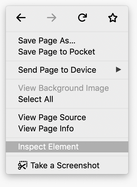
Right-click an empty area on your site and select Inspect Element from the menu.
You can also open DevTools with Ctrl+Shift+I (Windows, Linux) or Cmd+Option+I (macOS).
Simulate a mobile viewport
Click Toggle Responsive Design Mode  to open the mobile viewport simulator.
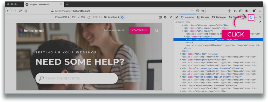
Figure 1. Responsive Design Mode toolbar
By default, Responsive Design Mode opens in a responsive viewport preset.
Mobile Device Viewport Mode
To simulate the dimensions of a specific device, open the Device list in the top bar and select a device preset.
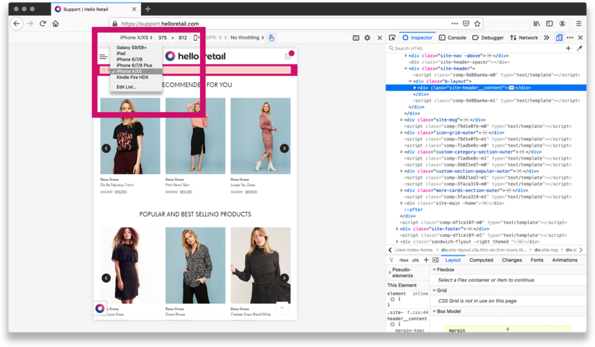 Figure 2. The Device list
Rotate the viewport to landscape orientation
Click Rotate  to switch the viewport to landscape orientation.
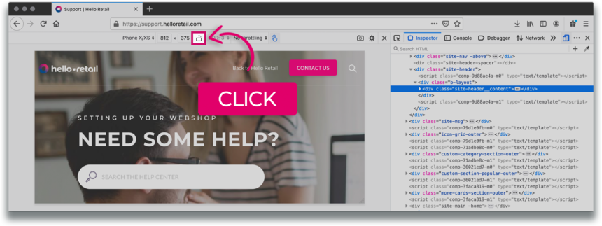
Figure 3. Landscape orientation
Notification
If you need instructions for previewing your page from a mobile perspective in another browser, select your browser:
 Chrome