
Test on Mobile Devices with Chrome

The purpose of this guide is to teach you, how to use the Device Mode to test how your website looks and performs on a mobile device using Google Chrome as a browser.
Limitations
With Device Mode you simulate the mobile user experience on your computer. This means, there are some aspects that the browser isn't able to simulate precisely. There can therefore be a few corner cases where the rendering will be different in the simulation mode versus on a real phone.
Open the inspector in Chrome
First, right-click an empty area on your website and select Inspect from the drop-down.

Simulate a mobile viewport
Click Toggle Device Toolbar  to open the UI that enables you to simulate a mobile viewport.
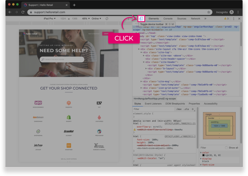
Figure 1. The Device Toolbar
By default, the Device Toolbar opens in Responsive Viewport Mode.
Mobile Device Viewport Mode
To simulate the dimensions of a specific mobile device, select the device from the Device list, which is on the top bar of your viewport mode.
 Figure 2. The Device list
Rotate the viewport to landscape orientation
Click Rotate  to rotate the viewport to landscape orientation.

Figure 3. Landscape orientation
Notification
If you need assistance on, how to preview your page from a mobile-perspective in another browser, please select your browser:
 Firefox